グラフの色を変更します。
グラフ色の配列を作成し、グラフの色を変更します。
注意点としては、線グラフは Line.ForeColor 、棒グラフは Fill.ForeColor となります。
【サンプルプログラム】
グラフの作成を基に作成しています。
Sub Graph_Create()
Dim this_wb As Workbook
Dim in_wb As Workbook
Dim in_ws As Worksheet
Dim out_wb As Workbook
Dim out_ws As Worksheet
Dim out_data_ws As Worksheet
Dim in_filename As String
Dim in_sheetname As String
Dim out_filename As String
Dim graph_title As String
Dim graph_range As String
Dim g_chart As Chart
Dim x_pos As Long
Dim y_pos As Long
Dim img_filename As String
Dim idx1 As Long
Dim graph_color(12) As Long
Dim graph_count As Integer
' グラフの色
graph_color(1) = RGB(255, 100, 100)
graph_color(2) = RGB(153, 204, 0)
graph_color(3) = RGB(255, 153, 204)
graph_color(4) = RGB(204, 153, 255)
graph_color(5) = RGB(180, 51, 51)
graph_color(6) = RGB(255, 153, 0)
graph_color(7) = RGB(255, 153, 0)
graph_color(8) = RGB(0, 128, 128)
graph_color(9) = RGB(255, 204, 153)
graph_color(10) = RGB(51, 204, 204)
graph_color(11) = RGB(153, 204, 0)
graph_color(12) = RGB(51, 102, 255)
' VBA マクロを実行しているワークブックを取得
Set this_wb = ThisWorkbook
' Sheet1 に設定情報を定義してあるので読み出し
With this_wb.Sheets(1)
in_filename = .Range("B1")
in_sheetname = .Range("B2")
out_filename = .Range("B3")
graph_title = .Range("B4")
End With
' 出力先のワークブックを作成
Set out_wb = Workbooks.Add
' グラフを出力する Sheetを取得し、名前の変更
Set out_ws = out_wb.Sheets(1)
out_ws.Name = "グラフ"
' 入力元のワークブックを開く
If IsFileExists(in_filename) = False Then ' ファイルの有無を確認
MsgBox in_filename & "は存在しません", vbExclamation
Exit Sub
End If
' ワークブックを開く
Set in_wb = Workbooks.Open(in_filename)
' Sheet を出力先のワークブックにコピーする
in_wb.Sheets(in_sheetname).Copy Before:=out_ws
' ブックを閉じる(保存しない)
in_wb.Close SaveChanges:=False
' データのSheetを保持しておく
Set out_data_ws = out_wb.Sheets(in_sheetname)
' データ部の範囲
graph_range = in_sheetname & "!" & "A1:" & _
GetLastColumnStr(out_data_ws) & GetLastRowStr(out_data_ws)
' グラフを表示するシートをアクティブにします
out_ws.Activate
' ----------------------------------------------
' 折れ線グラフの作成
' チャートの追加
Set g_chart = out_ws.Shapes.AddChart2(227, xlLine).Chart
' データの設定
g_chart.SetSourceData Source:=Range(graph_range)
' タイトルの変更
g_chart.ChartTitle.Text = graph_title
' 凡例の表示
g_chart.SetElement (msoElementLegendBottom)
' グラフの色の最大数と、グラフの要素数を比較して最大数を超えないようにする
If UBound(graph_color) <= g_chart.FullSeriesCollection.Count Then
graph_count = UBound(graph_color)
Else
graph_count = g_chart.FullSeriesCollection.Count
End If
' グラフの色を設定
For idx1 = 1 To graph_count
g_chart.FullSeriesCollection(idx1).Format.Line.ForeColor.RGB = graph_color(idx1)
Next idx1
' グラフ表示位置 (B2から開始)
x_pos = 2
y_pos = 2
With g_chart.ChartArea
' グラフの左端を変更
.Left = out_ws.Range(Cells(y_pos, x_pos).Address).Areas.Item(1).Left
' グラフの上端を変更
.Top = out_ws.Range(Cells(y_pos, x_pos).Address).Areas.Item(1).Top
' グラフの幅を変更
.Width = 500
' グラフの高さを変更
.Height = 250
End With
' ----------------------------------------------
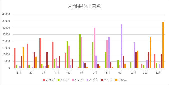
' 棒グラフの作成
' チャートの追加
Set g_chart = out_ws.Shapes.AddChart2(201, xlColumnClustered).Chart
' データの設定
g_chart.SetSourceData Source:=Range(graph_range)
' タイトルの変更
g_chart.ChartTitle.Text = graph_title
' 凡例の表示
g_chart.SetElement (msoElementLegendBottom)
' グラフの色の最大数と、グラフの要素数を比較して最大数を超えないようにする
If UBound(graph_color) <= g_chart.FullSeriesCollection.Count Then
graph_count = UBound(graph_color)
Else
graph_count = g_chart.FullSeriesCollection.Count
End If
' グラフの色を設定
For idx1 = 1 To graph_count
g_chart.FullSeriesCollection(idx1).Format.Fill.ForeColor.RGB = graph_color(idx1)
Next idx1
' グラフ表示位置
y_pos = y_pos + 15
With g_chart.ChartArea
' グラフの左端を変更
.Left = out_ws.Range(Cells(y_pos, x_pos).Address).Areas.Item(1).Left
' グラフの上端を変更
.Top = out_ws.Range(Cells(y_pos, x_pos).Address).Areas.Item(1).Top
' グラフの幅を変更
.Width = 500
' グラフの高さを変更
.Height = 250
End With
End Sub【成果物】


好きな色は、Excel等の「色の設定」でRGBを取得して設定してください。

コメント